Thursday, May 9, 2013

Rationale/Photographers' Statement


My Rationale

Photography is an art that many undermine. Many think that with a simple click of the shutter, us photographers can create a work of art, just like that, as easy as a snap of a finger. Oh, how wrong those people are. There is so much more to it. Dare I say, photography definitely is not for the weak-hearted or the impatient. It requires an analytical mind with good instinct and a keen eye for a good photograph. It is also a rather expensive activity, but it is a good investment in the long run.

Throughout this five month journey, I learned about the basic technical aspects which are the key factors to a good photograph—aperture, shutter speed, ISO, how to evaluate the exposure using the zone system and lighting. Turns out, behind something aesthetically pleasing to the eye, there is a formula and a science behind it. I also learned a bit on about the artistic side of photography as well, in terms of composition, combining or juxtaposing several elements to create a uniformed composition, and giving art direction. I also improved my communication skills—through presentations, how to listen, helping my coursemates out, accepting the lecturer's critique, and making sure my message gets through, in terms of taking a photograph.

As a budding photography hobbyist, I have gained a lot of experience throughout this course. Amidst all the blood, tears and sweat shed, it was all worth it in the end. The path I took was indeed a grueling yet rewarding one. I also learnt that photography is an art that cannot be absolutely perfected, it is a constant learning process. I faced several challenges throughout this course, such as taking really good photographs on the spot to minimize editing, having to endure the weather, traffic, tight deadlines to get my photographs printed, and quickly configuring the exposure in Manual Mode. In the end, I came out as a stronger and better artist, student and amateur photographer.

For the final assignment, I put everything I had learnt to the test. The theme I finally settled with, after weeks of feeling a bit lost, was 'Double Exposures: Juxtaposing Human and Nature.' I settled with this theme because I love the relaxing effect double exposures usually give the viewer, thus the sullen or relaxed expression on the models I photographed. I then juxtaposed their shots with varying nature shots, consisting of several angles, shapes, exposures, and textures. I tried my best to make sure each photograph compliments each other, despite its difference, and making sure nothing is out of place. I also put my Adobe Photoshop knowledge to execution in terms of editing. Cropping, free transforming, adjusting the contrast/levels, and screening were some of the editing that I did. One thing quite noticeable about the end product is that the models are of different walks of life, and this is in spirit of celebrating the rich cultural diversity in this country, and how everything coexists in harmony.

Now, I am definitely looking forward for more, and am feeling more confident to get involved in the design industry! Photography is an exciting art, and a very helpful one, especially for a designer like me. It is amazing how with a simple click of the shutter, and actually knowing what you are doing, you can figuratively snap a photograph which paints a thousand words.

— Hidayah

Final Project: Part II

Date: throughout April 2013

For the next tutorial session, Mr. Vinod suggested to my fellow coursemate, Annabel, to do multiple exposure portraits to make her photographs more interesting. As I felt that my theme was too boring, I asked him whether I could do the same with mine. After saying that mine will be quite different from hers, he agreed to let me try it as well.

In retrospect, my theme was finalised as 'Double exposure portraits: Human and Nature.' I photographed people of various age, background and colour, and used different kinds of overlays for their portraits as well to add variety, and in spirit of celebrating the diversity of the people here. I chose to photograph in monochrome because I find it more aesthetically pleasing and relaxing.

A lot of Photoshop editing was done in class. I helped out some of my other coursemates with this as well, as I know how to use the program. I did learn a few new tricks from Mr. Vinod along the way.

For my photographs, the tools I used were:

  • crop
  • free transform
  • levels
  • curves
  • contrast
  • screen
  • erase
  • mask
My photographs were then assessed and critiqued. I did have to edit the photographs a bit before printing the final 8x10" photos.

I printed some of the photos from my previous tutorial and he liked it. He told me to print the nature photos I used to screen over the portraits. The plant photos are not perfect, however, but I found them suitable to screen over the portraits. It's not about perfection, it's about finding a good balance!

One problem I faced was Amanda's portrait, the background looked really imbalanced, even after editing it. Then I realised, the wave reflections were not 100% parallel, and the boats made the composition unsettling. I made sure the horizon was perpendicular to the side of the photograph, however. So in the end, I went with the photo anyway. I hope it is acceptable.

Here are the final photos:


What's left for me to do now is to compile and finalise everything, and write my rationale, which will be posted here.

— Hidayah

Final Project: Part I

Date: throughout April 2013

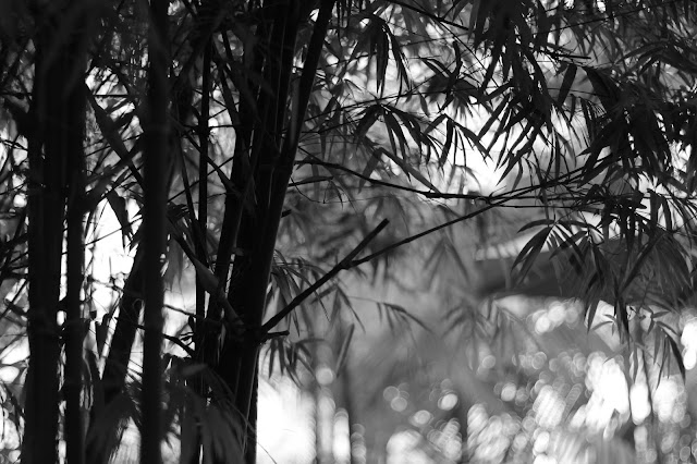
The last few weeks consisted of tutorial sessions. I was actually lost when it came to settling on a certain theme, so I just took random shots everywhere I went. In the end, Mr. Vinod told me that he favoured the shots of the plants. I learnt how to gauge a more attractive exposure, something I struggled with at first. I also shot everything in monochrome, with a small f number, thus the pretty shallow DOF effect.

None of the photos are edited.

Here are the initial shortlisted photos from one of the earlier tutorials.


— Hidayah

Lesson 5: Introduction to Lighting + Vintage Reenactment Portrait

Date: 29 March 2013

This week, we learnt a bit about studio lighting. We were taught about the basic types of lighting, main, fill, hair, rim and background lighting. Besides that, we were also lectured about strobe light photography and how to create a 'bouncing flash'.

We did not learn too much about lighting as Mr. Vinod said that it is a subject on its own and is too extensive to be added to our module, which only touches the tip of the iceberg when it comes to photography.


How to determine the position of the studio lighting.

How to identify what sort of lighting is used for portraiture.

How to use lighting properly.


In summary, the built in camera flash is nothing but a tool to make portraits look unflattering! Hooray for studio lighting!

We had a lot of fun with this assignment. We were told to do research on portraits from the 1940's and reenact it. We learned about art direction, which includes how use studio lighting, composition and posing, make-up and shadows... the like.

I learnt how to control studio lighting for this mini-project. It was tiring, but fun!

I was the first 'victim' for this project. This is the photo I chose to reenact, and the final product:

Me as a fighter pilot (on the right.) Pretty neat, huh?
I edited my portrait using Adobe Photoshop. I did not alter the photo, but only enhanced the parts that required it. Firstly, I corrected the exposure according to what I learnt from the zone system to make the portrait more vibrant and attractive. I added a texture to make the photo as similar as possible to the original. Then, I corrected some of the shadows on my face to match the original photo. I wanted to remove the blemishes from my face (pimples, gosh!) but in the end I did not because it was not too obvious and I had spent a lot of time editing the photograph.

— Hidayah


Lesson 4: Zone System + Ansel Adams Project

Date: 8-16 March 2013

We did not have classes over these two weeks, but we were instructed to complete our assignment based on the zoning system. It was the last technical installment to our academic calendar for this subject, and we were given a lot more flexibility in this assignment, and were highly encouraged to implement a creative touch to the photographs. Before that, Mr. Vinod taught us about Ansel Adams' Zoning System.

The Zone System is a photographic technique for determining optimal film exposure and development, formulated by Ansel Adams and Fred Archer.

We also learned about exposure metering, and how to determine the correct exposure using judgment, rather than relying on our DSLR, which usually sets everything to zone 5. An averaging meter cannot distinguish between a subject of uniform luminance and one that consists of light and dark elements.

Ansel Adams.

Some helpful graphics which we were instructed to refer to, and to put in our portfolio.

Here are some examples of Ansel Adams' gorgeous photography, which proves that a good work of art requires some science for it as well. He usually photographs wide shots of nature. He is infamous for working in large film format producing well composed, monochromatic photographs, rich in contrast, detail with a beautiful exposure.


For our exercise assignment, we were told to photograph 3 sets/pairs of photos. Each pair to have its exposure determined by the DSLR, then by us. The 3 sets had to be of the light zone, middle zone, and dark zone. We used the 9-step zone scale. This is what I came up with.


For the second part of the assignment, we were told to take 3 photos of any subject showing what we had learnt from the zone system. We were encouraged to conduct this during our class trip to Tioman over the weekend.

We had to get the original photographs printed with a white border of 5mm, in monochrome, saved as RAW/JPEG with a colour format of RGB, in full frame format, on 5x7" photograph paper at Applied Imaging.

At first, I took the pictures wrongly in terms of exposure, and was instructed to edit it. After editing, everything looked much better. I felt that I disappointed the lecturer, but it was part and parcel of the learning process, and I definitely benefitted from the bad critique.

Here are the photos I took:


— Hidayah

Lesson 3: ISO and Shutter Speed Exercise

Date: 1 March 2013

This week, we learned about ISO and shutter speed.

Based on research, I have learned that:

ISO is an acronym for International Standardization for Organization. In photography, this refers to 'film speed' or light sensitivity. Film speed is the measure of a photographic film's sensitivity to light, determined by sensitometry and measured on various numerical scales, the most recent being the ISO system. A closely related ISO system is used to measure the sensitivity of digital imaging systems.

In summary...

Smaller ISO, less light sensitivity, more saturation, less grain.

Higher ISO, more light sensitivity, more contrast, higher noise level.

Stop increments for ISO.
In photography, shutter speed or exposure time is the effective length of time a camera's shutter is open. The total exposure is proportional to this exposure time, or duration of light reaching the film or image sensor. Shutter speed along with the aperture of the lens (also called f-number) determines the amount of light that reaches the film or sensor. Conventionally, the exposure is measured in units of exposure value (EV), sometimes called stops, representing a halving or doubling of the exposure.

In summary...

The longer the shutter is open, more light is able to reach the sensor, hence, increasing the exposure.

Faster shutter speed means sharper images, but less light.
The stops for shutter speed.

From that we can derive that:

The holy grail of photography, the exposure triangle. Made up of three crucial and technical components, ISO, Shutter Speed and Aperture. Mix it with good composition, art direction, zoning, and you get the recipe to a beautiful photograph.

Here is the ISO exercise we conducted in class. The first one is without exposure compensation, only manipulating the ISO setting. (f/4, 1/15")

ISO 100

ISO 200

ISO 400

ISO 800

ISO 1600

ISO 3200

ISO 6400

ISO 12800
Here is the second part, with exposure compensation with a maintained aperture of f/4. As the ISO increased by one stop, the shutter speed increased by a stop as well.

ISO 100 • 1/15"

ISO 200 • 1/30"

ISO 400 • 1/60"

ISO 800 • 1/125"

ISO 1600 • 1/250"

ISO 3200 • 1/500"

ISO 6400 • 1/1000"

ISO 12800 • 1/2000"
Here is the shutter speed exercise, not uploading the each individual image due to bandwidth limitations. Here is the compiled/redone/finalised/approved assignment. Featuring a ceiling fan!


— Hidayah